Some thoughts on teaching inspired by Gian-Carlo Rota

I first learned of the mathematician Gian-Carlo Rota in Terence Tao’s upcoming review of the work of Jean Bourgain (to appear in the Bulletin of the American Mathematical Society, preprint here), where Tao quotes Rota’s aphorism that “every mathematician only has a few tricks”. Not only is this line clever, it is, I think, largely true – the prolific Paul Erdos comes to mind (although, in that paper, Tao argues that Bourgain, to the contrary, wielded many tricks). As I looked further into Rota, to my great pleasure I found that he was full of many such clever lines. What most struck me was his extensive writing and speaking about teaching (Rota spent the majority of his career at MIT) in particular. I must say that teaching always has fascinated me, as I have been fortunate in my life to have had many fantastic teachers and professors.

One of the most surprising things Rota says is the following:

We are kidding ourselves if we believe that the purpose of undergraduate teaching is the transmission of information. Information is an accidental feature of an elementary course in differential equations; such information can nowadays be gotten in much better ways than sitting in a classroom. A teacher of undergraduate courses belongs in a class with P.R. men, with entertainers, with propagandists, with preachers, with magicians, with gurus.

Gian-Carlo Rota (Ten lessons I wish I had learned (williams.edu))

I’m not sure if I fully agree with Rota’s argument here, but I can see his more general point. Certainly, when I remember some of my favorite professors, I still envision them vividly in the front of the class wielding their chalk. I remember their mannerisms and their speaking style much more than I remember what they were actually talking about. I can’t remember Green’s or Stokes’ Theorems off the top of my head but I still remember my calculus prof’s gripping lecturing style.

Is that to say that teachers belong in the “class of entertainers” as Rota says? If you look at the explosion of YouTube teachers over the last 10+ years, you might be tempted to think so. Many integrate fancy cartoons, graphics, intro music and showy body movements in order to grab the student’s attention. Are these necessary? Perhaps in the current market for attention on the internet. But, the arguable pioneer of this genre, Khan Academy, merely uses a blackboard and a voiceover, and he remains enormously popular. My point in saying all this is that being an entertainer is not really what is necessary – being engaging is. This does not necessarily require flamboyant displays of color and action, but can be as simple as relating the content to the students or, at the very least, taking care to avoid those leaps of logic that a seasoned professional makes instinctively (many times in confusing lectures, I tune out a few minutes in as I’m unable to understand one of the arguments, and thus can’t understand subsequent arguments). So, while I agree with Rota’s general point, I wish he had chosen a different class of professions with which to equate teaching.

In medicine, there is a large volume of fact-based information, things like “if you see a certain lab result <x, do y”. On the other hand, especially in the latter years, a lot of focus is placed on clinical reasoning, and this is where that base of facts really kicks in: you need to know, for example, all the contraindications of a beta-blocker so you can reason out which drug would best fit a patient in heart failure. However, this sort of factual information, I find, is not well-suited for lectures. Lectures become like a radio tower transmitting beams of facts (reference values, drug doses, etc) – but of course the human brain does not well remember that sort of knowledge immediately. This is in contrast to concepts, which can stick with you after the first exposure (if they are well-taught). In this regard, I do agree with Rota: “such information can nowadays be gotten in much better ways than sitting in a classroom”. Scores of medical students swear by Anki, a flashcard program, for memorization purposes, and, at least on the internet, many disdain going to lectures for this sort of stuff.

At the same time, conceptual knowledge, like physiology or clinical reasoning, is more well-suited to learning it by hearing, watching, or reading it explained it to you (in a good way), rather than drilling it into your head hoping it will stick. Indeed, in my experience, this sort of conceptual knowledge provides a scaffold for Anki-style knowledge to sit, and makes drilling those facts exponentially easier. I think that for this sort of information, teachers can be incredibly useful. Resources like Pathoma are popular among medical students because they distill the concepts so well.

I almost wonder if medical school could be reformed to teach concepts and reasoning in lectures, and supplying students with an official Anki deck from the school for the cold-hard facts.

Of friends and strangers

One of my favorite mathematical theorems (not to be confused with theory; a theorem is a statement that is true by a series of logical deductions) is the so-called “Theorem on friends and strangers”. The simplicity of the argument and the startling result is what makes it so fascinating. Below I’ll try to talk about it without using any mathematical jargon or symbols (more as an exercise for myself in exposition).

Here’s the setup: consider any party of six people. If two people have met before, call them friends; if they’ve never met before, call them strangers (there is no in-between, the semantics of what constitutes a friend versus any number of other personal relationship descriptors is besides the point). Then, the following statement is true: either three are mutual friends, or three are mutual strangers. By three people being mutual friends, I mean that each person is friends with everyone else – it’s a friendship triangle. Similarly, for three friends being mutual strangers, you can imagine it as a stranger triangle.

When I say any party of six people, I mean any. Try it at home yourself. Think of a group of six people, perhaps including yourself, perhaps by picking names at random from the front page of the New York Times. Then, designate each pair as mutual strangers or mutual friends, and you will always find a friendship triangle or a stranger triangle – no matter which six people you choose.

Eventually if you try this long enough you may start to wonder why? Let’s think about some arbitrary collection of six people standing in a room, and imagine that a piece of string connects every person to every other person. If you make them stand in a circle, it’ll look like this:

File:Complete graph K6.svg - Wikimedia Commons
This is called a K6 graph in math.

Now, paint the strings either red or blue: red if the two people the string touches are friends and blue if they’re strangers. Stated in this way, we can say that there will always be a red triangle (i.e. friendship triangle) or a blue triangle (i.e. stranger triangle). No matter how many ways you color the strings, you’ll always have either a red triangle or a blue triangle. There’s two ways we can go about convincing ourselves of this fact. Either we can try out all possible combinations of coloring the strings and count it for ourselves (long and tedious), or we can think a bit more abstractly. Let’s try the latter.

Let’s pick an arbitrary person from our group. I’ll call him A. A is attached to five strings (the five other people in the group). These five strings can be any combination of reds and blues, but there must be at least three strings with the same color (the possibilities are: 0 red and 5 blues, 1 red and 4 blues, 2 red and 3 blues, 3 reds and 2 blues, 4 reds and 1 blue, and 5 reds and 0 blues). So there’s always either at least three red strings or at least three blue strings connected to A.

Let’s take the case that there’s at least three red strings attached to A. I’ll call people on the other side of three of those red strings X, Y, and Z. If any one of X, Y, and Z are also friends with each other (i.e. have a red string) then we have a red triangle forming between those two friends and A! For example, if X and Y are friends, we have a red triangle AXY. On the other hand, if none of X, Y, and Z are mutual friends, then they are all strangers with each other, and so we have a blue triangle XYZ. So, in either case, you can find either a red triangle or a blue triangle.

On the other hand, if there are at least three blue strings attached to A, you can make the analogous argument (just changing the colors) as above, and sure enough, you can always find a red triangle or a blue triangle.

Therefore, any way that you color the strings between a group of six people, you will always find a friendship (red) triangle or a stranger (blue) triangle.

I think the theorem on friends and strangers is such a wonderful demonstration of the power of abstraction in mathematics. To paraphrase Gale and Shapley from one of my favorite papers “On college admissions and the stability of marriage”, mathematics isn’t really about numbers and figures, it’s about constructing logical arguments and being able to abstract from the particular to the general. The theorem is true for any group of six people (or really, it could be animals or anything else capable of being friends and strangers), and yet you don’t need to know anything about those six people to know that.

I should mention that the theorem on friends and strangers isn’t really a “serious” theorem by itself; it’s actually a special case of a famous theorem called Ramsey’s theorem, which deals in the general sense of exactly what we talked about in this article: coloring “connecting strings” (really called edges). Ramsey’s theorem began a whole sub-field of math in itself, now referred to as Ramsey theory, which, loosely, studies the conditions under which you can always find order in disorder. For example, in the friends and strangers theorem, we took an arbitrary group of six people (disorder) and showed, surprisingly, we can always find a pattern between them (order).

By the way, I said the other way we could convince ourselves that the theorem on friends and strangers is true is by trying out all the combinations and counting. You might be wondering how many possible combinations there are: there are in fact 78 possible ways of coloring the strings red and blue. Below is a picture of all the possibilities:

Courtesy of Wikimedia Commons

If you go through each of the drawings, you’ll find there is a red triangle or a blue triangle in each one. Or, you could rely on the tools of mathematical abstraction and save yourself the time.

Surgisphere and retractions in science

Why did NEJM and Lancet retract two COVID-19 papers?

Academics and laypeople alike may have now heard of recent retractions of two COVID-19 related papers published in high-profile medical journals. To recap: “Cardiovascular Disease, Drug Therapy, and Mortality in Covid-19” published in the New England Journal of Medicine (NEJM) and “Hydroxychloroquine or chloroquine with or without a macrolide for treatment of COVID-19: a multinational registry analysis” published in The Lancet – among the two most prestigious journals in medicine – were recently retracted mere hours apart.

Retraction is a process by which a journal essentially renounces a paper if significant issues that threaten the validity of its conclusion arise after publication; in this Internet Age, it means putting a big bold disclaimer on the website to make it clear that the study has been retracted, as you can see on both of the above journal’s sites. Retractions are not to be taken lightly, as they can be exceedingly embarrassing for a journal hoping to maintain respect for its peer review process.

Why were both of these articles retracted immediately one after the other? As one of my favorite blogs, Retraction Watch, which reports on retractions in the scientific literature, recounts, the answer is found in a common link between the two papers: Samir Desai, who co-authored both papers. Desai is the founder of a company named Surgisphere, which has the jargon-laden mission statement to “relentlessly pursue advancements in machine learning, artificial intelligence, and big data … [empowering] healthcare providers to make better, faster, and more accurate decisions.” Surgisphere provided the data for both studies. The other coauthors seem to be academics associated with various hospitals and research centers; it’s unclear what previous relationship they had with Desai prior to the collaboration.

However, Retraction Watch reports that some concern in academic circles began to percolate about the validity of the data (although I could not find specific criticisms; they are perhaps somewhere on the Twittersphere). Soon, both NEJM and Lancet grew concerned enough to ask for the raw data that the authors used. That’s where the story takes a turn: three of the four authors of the Lancet paper, barring Desai, wrote to the editor claiming that Desai and Surgisphere were not allowing them access to the original data. While their correspondence claims that Surgisphere cited some sort of legal agreement as the reason for why it could not share the data, they make it clear that they lost faith in the veracity of the data because of this refusal. The Lancet retracted the paper, and hours later, this time with the request of Desai (!), NEJM retracted the other paper.

The story is intriguing precisely because it sounds so mysterious, and even after browsing the web for more information, I was left with more questions than answers. The original correspondence that felled the Lancet paper was couched in professional terms and so it is a bit difficult to decipher what the underlying story is. What exactly did Desai say that led his coauthors to turn on him? Was Desai refusing to share the data because he doctored it, and hid behind some obscure legal justification? Without the data, it’s impossible to say to what extent it was doctored. But then, why did he request the NEJM retraction? Did he realize the writing was on the wall after the Lancet retraction? It’s an altogether puzzling story and stubbornly devoid of details.

Symptom of a larger issue?

In the days since the retractions, people have wondered: was this just a sole incident, or a symptom of a larger problem in science, especially during COVID-19? I think there are significant reasons to lean towards the latter. As I have written about before, numerous issues with academic publishing have arisen or at least exacerbated due to COVID-19. Journals have had to face a deluge of submissions, as researchers running the gamut of scientific specialties and sub-specialties try to cash in on the COVID-19 gold rush (both figuratively and literally, as governments and grant organizations have opened up huge sums of money to fund COVID-19 research). I can’t blame the researchers entirely though – they are perhaps simply reacting to the incentives and pressures present in the world of academia: doing more, publishing more, and obtaining more grants leads to citations and promotions.

On the other hand, journals aren’t entirely blameless either. Journals, especially at the very top end of the distribution like NEJM and Lancet, heavily curate their reputation by accepting only the most “high-impact” papers. This leads to greater readership of their journal, more subscriptions, more attention in the news media, and overall more prestige. It’s why NEJM and Lancet accept only (approximately) 5-10% of papers submitted to them. NEJM, for example, explicitly states on its website, that they look for “scientific accuracy, novelty, and importance”. A paper can be entirely scientifically correct, but if it is not deemed novel or important enough by the editors – a subjective measurement at best – it has no chance.

I would argue that such journals are seeking to curate their reputation during COVID-19 as well, and are most interested in those papers that can significantly impact our understanding of it; in medical journals, those papers that can significantly impact medical practice would be deemed important. For example, the retracted Lancet paper showed that hydroxychloroquine – a much talked about COVID-19 treatment – was unsafe to use on COVID-19 patients, and prompted the World Health Organization to stop a trial studying it’s efficacy (although it resumed the trial after the retraction). I would argue that such curation can inevitably lead to instances where certain papers are given favorable treatment by editors if they think it will be a “hot” paper.

Counterpoint, or, in defense

At the same time, I’m hesitant to deride all of science as being tainted because of the issues above. It’s understandable that researchers feel the need to publish something about COVID-19 and I applaud the three co-authors who stepped forward and told the Lancet that they do not have faith in the veracity of Desai’s data.

As well, perhaps the reaction to these retractions has been disproportionately large simply because NEJM and Lancet are two of the most prestigious and widely-read journals in medicine. I think it also sets up an interesting imbalance whereby articles published in the likes of those journals are more criticized and discussed precisely because more people are reading them. That is to say, there could very well be many multitudes of incorrect papers in low-end journals, but no one has noticed, because, well, no one is reading them.

And what of peer review? It is an imperfect tool in the best of times, and these are evidently not the best of times. Reviewers, who volunteer their time on top of their usual academic duties, do not – and cannot – redo the entire paper line-by-line in order to find inaccuracies. Inevitably, their job has been made harder by COVID-19-related interruptions to their regular duties and the increased volume of submissions. I do not envy them.

While evidently there are issues with scientific publishing, the Surgisphere story also demonstrates, to me at least, the good. Desai’s coauthors were willing to speak honestly with the editor in the interests of scientific integrity – indeed were willing to retract their own work for it. The errors in the papers were still found by other researchers, a sort of post-publication peer review. And really, two retractions among the numerous COVID-19 papers NEJM and Lancet have published is a surprisingly good track record, all things considered. The Surgisphere story, while unsettling, ultimately does not shake my trust in either of these two journals: they were proactive in dealing with the post-publication concerns and were quick to retract the papers after the issues were confirmed. While the Surgisphere story evidently exposes some undesirable aspects of science, one can’t ignore the people and institutions that worked to right the transgression.

Ultimately, science isn’t perfect, and perhaps never can be, but it works towards it.

Could we use preprint overlay journals in medicine?

As I wrote about previously (Preprints and the pandemic), preprints have gained in popularity during COVID-19 as researchers either attempt to preempt or bypass traditional journal publishing venues. Notably, however, preprints are not vetted through peer review, and as I wrote in that previous post, this brings with it a whole range of issues. Medical research is extraordinarily sensitive in the way it can affect, for better or for worse, human health and lives. In response, some researchers have begun checking COVID-19 related preprints: for example, the Sinai Immunology Review Project (SIRP) regularly writes reviews for preprints posted to bioRxiv and medRxiv about COVID-19. You can read about their efforts here.

Such initiatives are extremely interesting to me and reminded me of an emerging model of publication in mathematics: the arXiv overlay journal. This mode of journal publishing only arose in the past few years as discussion in the mathematical community about what role a journal actually fulfills gained a lot of attention. Mathematics was, I think, uniquely positioned to have these discussions, for a few major reasons.

There are perhaps three major roles a journal fulfills: peer review, copyediting, and dissemination. In mathematics, posting preprints on arXiv has long been standard, and it is common for researchers and research trainees to keep up-to-date with arXiv categories that are relevant to their interests. Much like how researchers regularly browse their favorite journals, mathematicians (and others) stay up to date on arXiv either by going on the website or subscribing to arXiv emails. So, the dissemination function was already being fulfilled outside of journals.

Secondly, copyediting was already being handled by using the typesetting language, LaTeX. LaTeX is the standard for writing papers in fields like math, physics, and economics; indeed, as the mathematician Scott Aaronson has written, a common rule-of-thumb to tell a “crackpot” math paper is to see if it’s not written in LaTeX. It is an extraordinarily powerful language that provides a consistent and professional look (either by using the default theme or the American Mathematical Society’s) to papers. As well, it can handle drawing graphs and charts, drawing graphics, importing graphics from R and other programs, etc. With authors already handling all that, the copyediting function was already being fulfilled outside of needing journals to do it.

Recognizing the fact that the dissemination and copyediting roles were already taken care of by arXiv and LaTeX, the arXiv overlay concept sought only to fulfill the peer review function. The journal Discrete Analysis, founded in 2016 by the esteemed mathematician Timothy Gowers (who is perhaps best known in general academia for his crusades against Elsevier and other huge publishing corporations at www.thecostofknowledge.com), is one of the earliest such examples. Essentially, the articles simply live on arXiv. Submissions only consist of inputting the arXiv URL to a submission portal. After that, the typical journal process ensues: editors find referees and the usual process of revisions, rejections, or acceptances occurs. Once accepted, the journal simply posts a link on their website forwarding the reader to arXiv, and the article is given a DOI just like in any journal. The arXiv entry is updated to indicate it has been published in Discrete Analysis (or, whichever journal). This is why such journals are called arXiv overlay journals: they simply overlay that peer review “layer” on to the arXiv system. In effect, the journal simply provides the seal of approval of peer review.

An aside: given that Gowers was the founder of Discrete Analysis, it is not so difficult to believe that part of his motivation in founding the journal was as a response to the enormously high profit margins that journal publishers like Elsevier make, whom he has ardently criticized. Given that peer review is done for free (ie. reviewers volunteer their time), really the only service that journals were providing through their own investment was that of dissemination and copyediting. But, if that function is already being fulfilled, then why not just have a truly free journal (free to submit and free to read) using reviewers as volunteers, as they already are. It’s an enormously interesting idea of Gowers that ties into numerous debates about academic publishing, and, in my opinion, demonstrates why Gowers is one of the most talked about mathematicians today.

All that said, could the preprint overlay concept be introduced into medicine? bioRxiv and medRxiv are increasingly taking on that dissemination role: their preprints are often tweeted about and discussed online. The one stumbling block is the lack of standardization of how papers look on those servers, but perhaps this could be remedied by introducing some common requirements for certain aspects like how graphs should look. A more long term solution would be for LaTeX to be adopted in medicine and the life sciences as well – as a LaTeX fan, I would love to see such a day.

Considering the growing use of preprints in the biological and medical sciences, there is perhaps the potential to extend or build on initiatives like the SIRP, which I mentioned at the beginning of the article, to implement a preprint overlay model for other scientific fields. It is not much of a leap to go from a program like SIRP, where people are writing reviews of preprints, to a preprint overlay concept. If the review of the paper is good, just post a link of it on a website. When you strip it down to its essence, as Gowers demonstrated with his journal Discrete Analysis, isn’t that all a journal is – a compilation of papers deemed “worthy” by an editorial committee?

I would be interested to see such a publishing model in other scientific fields as well, including medicine, thus helping to maintain the standard of peer review while recognizing the proliferation of preprints.

On “admissions consultants”

I originally wrote this on LinkedIn.

I’ve noticed an increasing number of so-called “admission consultants”, either advertised online, on Facebook groups, groupchats, or heard about through word-of-mouth. These sort of services have always made me enormously uncomfortable and they are just plain unethical. I had some inkling of these services before but now seeing some of my peers join these services as “consultants” has made the whole thing more real and imminent for me.

These sort of services are often wrapped up in feel-good jargon claiming that they do such things as “level the playing field”, and can help high schoolers or undergrads gain insider knowledge to get into the program of their choice, often charging hundreds or thousands of dollars for such a golden ticket. For all this advertising, these services actually accomplish the opposite of what they claim. They don’t level the playing field – they only skew it further towards those who can pay for such services, who are likely already advantaged in the admissions process. At its best, these services only perpetuate the increasing concentration of high-income students in “elite” programs; at their worst, they can be downright illegal.

Even worse, these sort of companies prey on what are the very real fears and anxieties of students. They make students think that they HAVE to use such services if they want to be competitive with their peers. Applying to university at any level is a huge life decision, and these companies presenting themselves as a cure-all are simply deceiving students. There’s a reason these companies charge hundreds or thousands of dollars – because they know that once they seize on a student’s anxieties, they have carte blanche in charging them.

I’ll take my own alma mater, BHSc at Mac, as an example. As one of the most “competitive” programs in the country, an entire industry has begun to sprout purporting to help applicants with their supplementary applications (supp apps). For one, such services are explicitly forbidden by Health Sci. Secondly, no one can really tell how to answer these questions. You might hear some people selling their services claiming that they were involved in marking the apps as a fourth year. This is true, fourth years do mark some apps. However, I can guarantee you that no one who has marked these apps can give you a golden ticket into Health Sci: the questions change every year, the marking rubric is inherently open-ended, and you never know who will read your app. And then of course, with a 5% acceptance rate, there are inevitably going to be way more qualified applicants than positions. No “admission consultant”, however expensive, can get around these facts.

Lastly, there’s a huge number of BHSc alumni who would be happy to talk to you for FREE. At any given time, there’s around 800 current BHSc students, and even more alumni. Tons of us would be DELIGHTED to talk about our experiences (in my experience, Health Scis love talking about themselves). Obviously, we can’t look at your supp app. But we can talk about the program and try to give you a gist of what the program looks for in its students. I know I personally and tons of my friends would be delighted to talk to anyone interested in Health Sci.

What if you don’t know anyone? That’s okay too! Honestly, all the information you need is on the website. I didn’t know anything about BHSc when I applied and certainly didn’t know anyone in the program. Don’t feel like you have to have a million volunteers activities and clubs to be competitive – BHSc really does not care, and the supp app doesn’t even ask you to talk about your extracurricular activities. The supp app is meant to get a feeling of who YOU are, whether that’s volunteering in your community or watching old Marlon Brando films (all I did in high school).

Having said that, I’m always open to talk about BHSc (or Ontario med schools for that matter) either on LinkedIn or via email (maaz@mmaaz.ca). Feel free to pass my contact info along to anyone you know who is interested in BHSc.

Preprints and the pandemic

One of the most interesting things about the COVID-19 pandemic, at least from a meta-academic sort of way, is the way it has dramatically upended academic publishing. Suddenly, reams of new research about the SARS-CoV-2 virus and the COVID-19 disease is constantly being put out (interestingly, not just in fields like virology as we would expect, but even from economists, mathematicians, physicists, sociologists, etc.) and that research needs a place to go. While many biological and medical journals have tried to keep up with the volume of submissions and have indeed even managed to cut review times for submissions, another venue that these researchers have increasingly turned to is posting preprints.

Preprints are version of papers before the peer review stage. They are typically a precursor to publication in a peer-reviewed journal (although sometimes, like Perelman’s proof of the Poincare conjecture, for which he won – then denied – $1 million, they are a way of completely bypassing the traditional publication process). While they have long been a common medium of disseminating papers in some fields like economics, math, and physics on the arXiv preprint server, in bio and med fields (except for the subfield of quantitative biology, which has its own section on arXiv) preprints have not really been used. That began to change in 2013, when bioRxiv, a preprint server for the life sciences, and in 2019, when medRxiv, for clinical medicine preprints, were launched.

Those launches were not met without opposition. Especially in the medRxiv case, there was significant concern among some that medical research was inherently different than math or physics because medical studies tend to have a greater societal fallout – a quick sweep of social media or a news site will yield numerous discussion on medical topics like diet, exercise, weight loss, “cleanses”, and the like, but perhaps nowhere near as much hype on a topic like Ben Green and Terry Tao’s proof of arbitrarily long arithmetic progressions in the primes. As hurtful as this is to me to say as a fan of mathematics, it’s easy to see that a medical study falsely purporting a new cancer treatment could be far more damaging to people’s lives than a faulty proof that P=NP.

So, in a sense, a certain sensitivity needs to be accorded to medical research. As well, the Ingelfinger rule, named for the erstwhile editor of the New England Journal of Medicine (NEJM), prohibited NEJM from publishing results that had been presented elsewhere, either at a conference, in the news media, or in other journals. This rule was adopted in other journals as well, and effectively disallowed publishing of preprints in medical journals for a long time. This effectively kept the preprint idea from medicine for decades, while it began to thrive in math and physics.

Then came the pandemic. As I said before, it arguably upturned many of the old academic norms in bio and med. In a sense, it was a perfect storm. medRxiv had just been launched a year ago, but was seeing slow adoption. Some medical journals had already begun to relax the Ingelfinger rule to allow for preprint posting. These two facts, combined with the volume of research in the midst of COVID-19, precipitated a surge in preprint posting on bioRxiv and medRxiv. Now, some of the most important papers that form the base of our knowledge about COVID-19 were first posted as preprints. An example is Hoffman et. al.’s paper which was the first to describe how the virus enters cells; first posted on bioRxiv, it was later published in Cell, where it has, at the time of writing, been cited 1474 times (according to Google Scholar).

MedRxiv now receives hundreds of submissions a week, a huge surge since before COVID-19. Indeed, I mined medRxiv metadata for the first four months of 2020 and found that on many days, 100% of all submissions were related to COVID-19. The pandemic has arguably driven growth in both medRxiv and bioRxiv usage as the graph below shows.

Number of total papers and COVID-19 related papers on arXiv, bioRxiv and medRxiv for the dates of January 1, 2020 to April 28, 2020 (inclusive) reported in weekly totals (n=17) with date on axis indicating start of week. Source: me; made in R.

This is helpful as a fast way of disseminating information in an evolving situation. Yet, the issue with the lack of peer review remains. While both servers do some basic level of screening for rigor and scientific content, this is not to the level of traditional peer review. To their credit, both websites have disclaimers on the top alerting readers that the results are not peer reviewed and that decisions about human health should not be made based on preprints.

Still, some fail to heed these warnings: infamously, the LA Times reported a grossly exaggerated story claiming SARS-CoV-2 was mutating to become more deadly, on the basis of a bioRxiv paper. Such reporting and “hyping” of COVID-19 research, especially ones that are not peer reviewed, only serve to increase panic – and possibly even cause panic fatigue, causing people to take the pandemic less seriously.

What’s the answer to these problems? It’s difficult to say. There are some possible solutions. I was immensely interested by an initiative by the Precision Immunology Institute at the Icahn School of Medicine in New York. This initiative, called the Sinai Immunology Review Project (SIRP), posts comments on bioRxiv and medRxiv papers in the field of immunology. Relevant papers are “reviewed” by trainees (ie. PhD students), and the reviews are validated by a faculty member. Their initiative is so interesting to me, especially as it harnesses the brainpower of trainees at a time when their research work may have been halted by the pandemic. You can read a wonderful description of their work here in Nature Reviews Immunology. I wonder if other initiatives like this have sprung up, similarly using students; I for one would love to be involved in writing reviews.

Ultimately, for the time frame in which COVID-19 emerged, I think that academics and publishers have been surprisingly fast to adapt. In any rapid transition, there are inevitably going to be some kinks. How the world of academic publishing will look like post-pandemic depends strongly on if and how those kinks are worked out – I have some ideas on that which I may explain in a future post.

How Rich is Rich in Canada? A Statistical Approach

Our perception of wealth is often personal and shaped by our own experiences. I began to notice this divide while talking with friends from different backgrounds about what being rich meant to them. One of my best friends, who had lived for some years in the community housing projects in Toronto, considered being rich to be being able to pay your mortgage and bills comfortably. Meanwhile, another friend, whose family owns a successful restaurant, said he would consider himself rich if he owned a Lamborghini. Clearly, two wildly different views of what it means to be rich, from two wildly different backgrounds. Indeed, I would argue that human greed (or ambition, whichever you prefer) makes it difficult to be cognizant of one’s own class. When asked to define rich, we have a tendency to look up on the socioeconomic ladder – being “rich” is something that is always above your status. I’ve no doubt that there are millionaires who don’t consider themselves rich, if only for the fact that they aren’t billionaires.

Given that people’s concept of wealth is subjective, what then does it truly mean to be rich? For a more objective exploration, we might consider studying the statistical distribution of income in Canada’s population, courtesy of Statistics Canada.

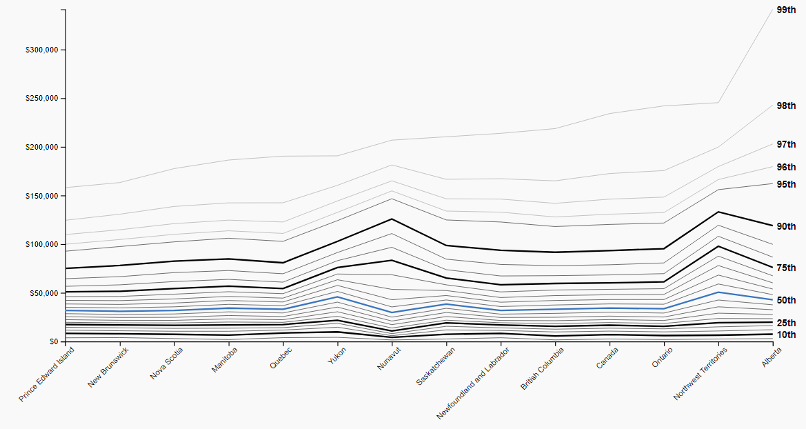
The graph below shows the percentiles of income distribution of individuals (not households) in Canada using data from the 2016 Census, the most recent data of its kind.

Source: Statistics Canada (2016 Census)

While StatsCan also publishes exact values for these statistics, visual estimates from the graph will suffice, for fear of the details distracting from the main point of the article. The blue line, representing the median, or the “middle” of the distribution, shows the income threshold that exactly equally divides the population: 50% of people are above that line, and 50% of people are below that line. This appears to be around $35,000 in Canada, and slightly lower or slightly higher depending on the specific province.

The line I’m interested in is the topmost one – the 99th percentile. This represents the income at which one makes as much or more money than 99% of the rest of the population (whatever population that is). Said another way, that is the line representing the infamous “1%”, everyone’s favorite group to hate. The 1% have become the poster child for people’s growing worries about income inequity in Canada and indeed the world – with good reason. An individual income of around $230,000 qualifies one to be part of that elite group in Canada, nearly 7 times as much income as the median. Interestingly, we see the 99th percentile cutoff in Alberta much higher than Canada overall, although this may have changed in recent years due to the diminishing state of the oil industry there now.

We can delve deeper into the statistics by looking at the breakdown within Ontario, my home province, shown below.

Source: Statistics Canada (2016 Census)

Perhaps unsurprisingly, while we see that the percentile lines are relatively the same for the various census metropolitan areas (CMAs) shown, at the very top of the income distribution, from the 95th percentile and above, Toronto is more heavily skewed than other cities in Ontario. To qualify as a 1%er among Toronto earners, one needs an income of around $300,000 – $70,000 more than the Canadian threshold, and $60,000 more than the next highest 1% threshold in Ontario (which would be Hamilton, with a 1% threshold of $240,000). Startlingly, Toronto’s 1% threshold is 10 times as much as the median income in Toronto.

Now, what is this all to say? Firstly, the gap between the 1% and the median of income earners is sizable. However, one doesn’t even need to venture into the 1% to see wide disparities in income. An income of $100,000 – about a third of what the 1%ers make – still puts you around the top 5% of earners (I say around to account for regional variances which may put you slightly above or slightly below the threshold).

StatsCan considers the “middle class” to be the middle three quintiles of the income distribution. Quintiles divide the income distribution into equal fifths, so that you have those from 0th %ile (read: percentile) to the 20th %ile, 20th %ile to the 40th %ile, and so forth until the group comprising the 80th %ile to the 100th %ile. The middle class is the middle three quintiles, meaning those whose incomes are between the 20th %ile threshold and the 80th %ile threshold. The three quintiles defining the middle class are sometimes further described as “lower middle class”, representing the lowest quintile of those three (20th %ile to 40th %ile), and the “upper middle class”, representing the highest quintile (60th %ile to 80th %ile) of those three. Rich has no concrete definition, but I’d venture to say that anyone in the top 5% (earning $100,00 or more) of earners is well beyond what we can call middle class! Note that we have been using individual income statistics, and that a household income of $100,000 would land you a spot solidly in the middle of the middle class.

All that said, while all these statistics have, admittedly, been an exercise in imbibing class consciousness, arguably the focus on the 1% is misguided if we truly wish to combat income inequality. Earners in the 1% are more commonplace than you think, and those who comprise that group tend to be professionals in healthcare, engineering, law, and management (source: Statistics Canada “Education and occupation of high-income Canadians). However, even those professionals are at the bottom rung of those supposedly elite 1%ers. If you’re looking for the real culprits of income inequality in Canada and the world, look higher up. The 0.1%, of which there are 26,850 in Canada, have a threshold of individual income of $826,800. Looking even further up on the distribution, the top 0.01%, of which there are a mere 2,685, have a threshold of a whopping $3,636,000 (!) to be a part of their privileged circle (Source: Globe and Mail).

I highlight these statistics for two reasons. Firstly, as I mentioned before, for the purposes of class consciousness – I believe it is important for people in those higher echelons of income (the 5%ers or the 1%ers or whoever you choose) to be cognizant of their elevated place in society. Being aware of the privileges afforded to oneself can engender sensitivity, compassion, and empathy towards your fellow man or woman. Secondly, the issue of income inequality is shaping up to be one of the great social and economic problems of our time, and prolonged concentration of money into the hands of the few on the backs of the toiling masses threatens to return us to the feudalistic or aristocratic days of old. Indeed, historically, such systems tend to not end well (think: French Revolution). That said, the focus on “the 1%” is perhaps slightly misguided in the populist crusade against the rich, and indeed the group actually being targeted in equality-focused economic policy such as the so-called “millionaire’s tax” isn’t the 1%, but their far more exclusive compatriots, the 0.1% or the 0.01%.

Sources

Statistics Canada. Total income explorer, 2016 Census. https://www12.statcan.gc.ca/census-recensement/2016/dp-pd/dv-vd/inc-rev/index-eng.cfm

Statistics Canada. Education and occupation of high-income Canadians. https://www12.statcan.gc.ca/nhs-enm/2011/as-sa/99-014-x/99-014-x2011003_2-eng.cfm

Globe and Mail. Canada’s 1 per cent gets another big income boost (Rachelle Younglai 2017). https://www.theglobeandmail.com/report-on-business/economy/canadas-1-per-cent-gets-another-big-income-boost/article36993871/